Choosing a color isn’t a decision to take lightly, as it sets a room’s mood and impacts how your furniture looks. Don’t do these, say the pros:
MISTAKE #1: PAINTING A CEILING FLAT WHITE
The biggest wall in a room is the one most of us don’t even think about. Never paint a ceiling dead white because most white paints have a bit of grey in them, and it takes the room down. Choose a cream shade instead. (And we suggest hiring a pro for this job.)
MISTAKE #2: GOING TOO MATCHY-MATCHY
It’s tempting to keep things easy and just take a fabric swatch to the paint counter. Not so fast. Avoid matching your walls to a colour in one of your fabrics. It will be too strong. Opt for a greyed-out version of the colour instead.
MISTAKE #3: LEAVING OUT “PALATE CLEANSING” ELEMENTS
Once you fall in love with a colour, it’s easy to go overboard. The biggest mistake people make when they’re trying to be colorful and exciting is to forget that you need to balance it with neutrals. Architectural elements in white or simply a few greys, can give your eye a place to rest.
MISTAKE #4: PLAYING IT TOO “SAFE”
Conversely, if you go with a palette of neutrals, don’t forget to add a few stronger colours. One of the biggest mistakes people make with neutrals is not using enough contrast. Try introducing elements that add intense personality. Make it gutsy, or else it’s boring.
MISTAKE #5: USING WILDLY DIFFERENT COLOUR SCHEMES FROM ROOM TO ROOM
You know it when you see it: The neutral living room says “relaxed, coastal chic,” then the vivid bathroom goes “1920s decadence.” Even when not using the same colours throughout, make sure there is a sense of flow, and rooms feel connected. The bedroom should never feel like it’s in a completely different house from the living room – the whole house has to make sense as one.
MISTAKE #6: AND USING THE SAME COLOR PALETTE EVERYWHERE, TOO
Faithfully sticking to your favorite hues in every room can create an “uptight” vibe. Know when to pull back. A two-colour scheme can be great, but there has to be some relief, or it comes across as too stitiched-up and makes everything seem stiff.
MISTAKE #7: FORGETTING THE IMPACT FINISH MAKES
For instance, an eggshell finish can take the intensity out of a rich hue — for better or worse. Darker colors in general can read very flat, so use a high-lustre finish. If you decide to go this route, do your homework first. Good prep is key to any glossy paint finish, so skim-coating the walls really helps. You can get a deep, rich gloss without going to the expense of lacquering.”
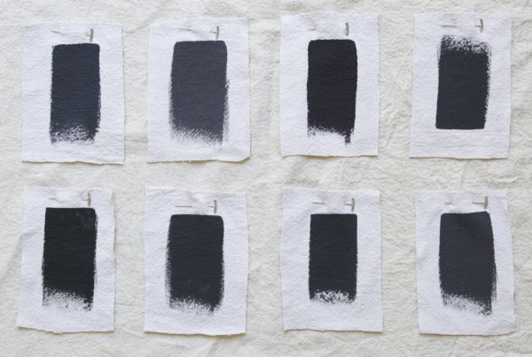
MISTAKE #8: SELECTING A ONE-DIMENSIONAL HUE
This is another pitfall that presents itself with more dramatic choices. Colours that have no depth are oddly fluorescent. They will leap out at you, rather than pull you in. It’s a subtle difference, but failure to recognize it is what sometimes makes people afraid of using colour. It might be why cream ends up looking orange on the walls.
MISTAKE #9: PRESSURING YOURSELF TO FIND- AND STICK WITH- A FOREVER COLOUR
With all the hassle of painting, it’s understandable to keep falling back to the same look you’ve always had in your houses. But like personal style, our rooms can change over time.
